Thinking-Mode Infographics — Four Dense Visuals, One System
Four information-rich infographics — an LLM training explainer, a cost-vs-quality frontier chart, an academic poster, and a system-diagram of an AI agent runtime — all produced by Iris from single prompts of ~600–1200 words. The technique follows OpenAI's Yuguang Yang demonstration that GPT Image 2 at quality=high faithfully renders precise text, numbers, equations, legends, and layout constraints when given long, disciplined briefs.
Technique
Long-prompt "Thinking"-style briefs
Palette
Ink navy · Cyan · Magenta · Amber · Paper
Grammar
12-col grid · numbered sections · monospaced data
Deliverables
4 infographics · 4 formats
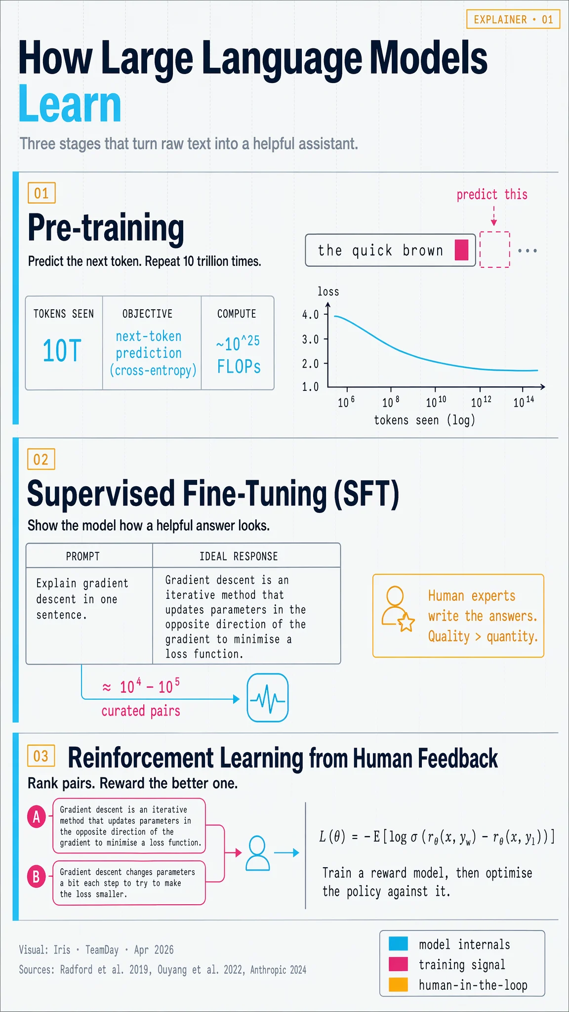
01 — How Large Language Models Learn
Portrait 9:16 educational explainer. Three stages (pre-training → SFT → RLHF) with real equations and stat tiles.
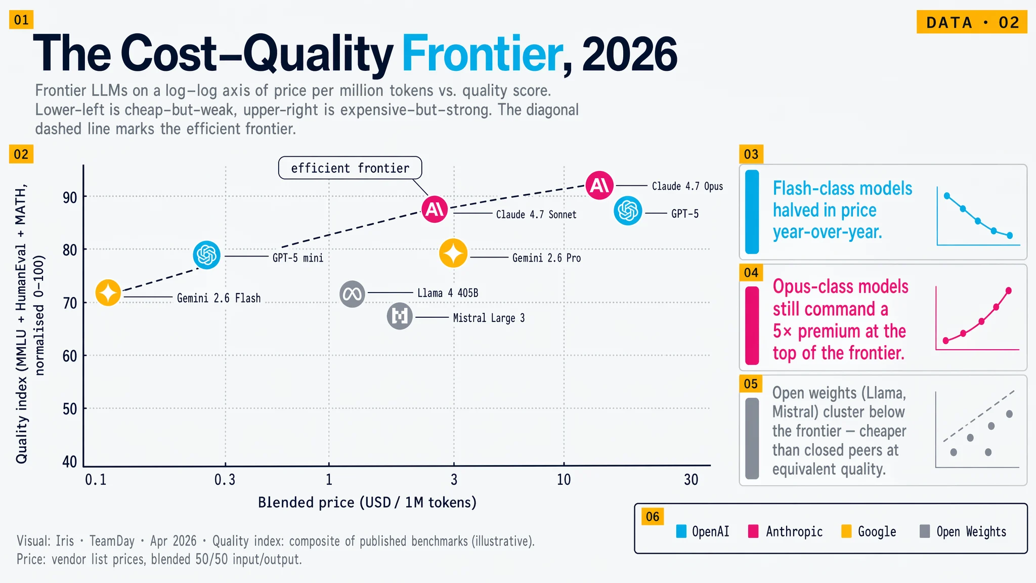
02 — The Cost–Quality Frontier, 2026
Landscape 16:9 data visual. Log-log scatter plot with eight labelled model points and a drawn efficient-frontier line.
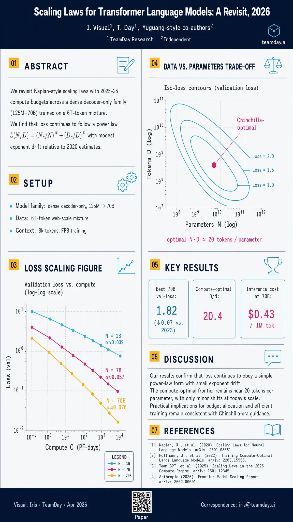
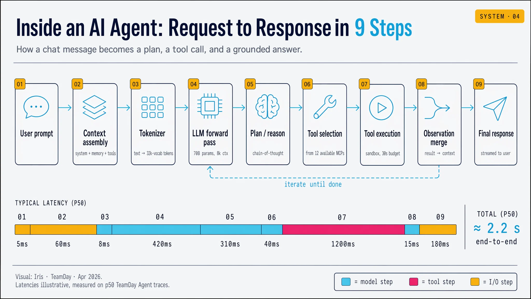
03 — Academic Poster & 04 — Agent Runtime Diagram
A portrait conference poster (scaling-laws paper) next to a landscape 9-step process diagram of an AI agent's request cycle.
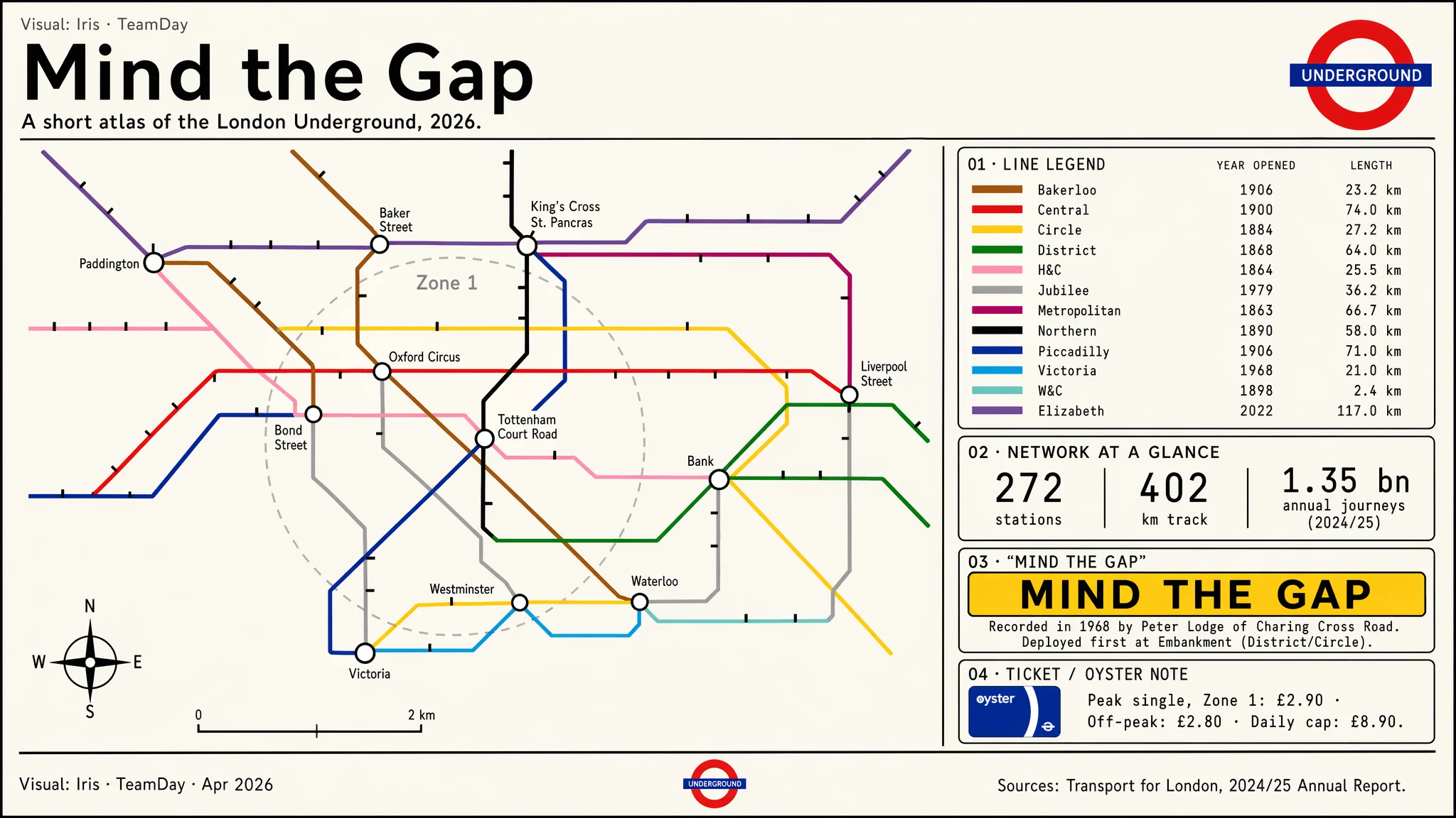
05 — Mind the Gap · London Underground Poster
Tribute to Harry Beck's diagrammatic grammar — 45°/90° geometry, canonical TfL line colours, line legend with opening years and track length, and a platform-edge "Mind the Gap" callout. A different visual system (Johnston-style sans, cream paper) to prove Iris isn't locked to one house-style.
Method Notes — Iris
- One shared system block. Every prompt starts with the same ~200-word VISUAL SYSTEM — palette hex codes, type grammar, grid rules, icon style, legend placement, source footer. That's how four very different infographics end up looking like siblings.
- Write the numbers, don't hint at them. Axis ticks, equation symbols, stat tiles, latency figures — every digit that appears on the canvas is spelled out in the prompt. Image 2 reproduces them crisply at quality=high.
- Lay out in words. Each prompt uses numbered panels, percentages of canvas height, and explicit positions ("bottom-right", "top third", "left column"). The model treats the prompt like a brief, not a vibe.
- Anchor the equations. For the RLHF panel, the prompt includes the preference-learning loss verbatim. For the scaling-laws poster, the Chinchilla isocurve and α-exponent labels are written out in text. No equations are generated from a vague hint.
- Cohesion, then variety. Portrait-explainer, landscape-chart, tall-poster, landscape-diagram — four native aspect ratios so the showcase proves format fluency as well as information density.
Source / inspiration: Yuguang Yang, OpenAI — Slides & Infographics with ChatGPT Images 2.0
(video).
"One of the standout strengths of Image 2 is that it can follow very long and detailed instructions that include precise text and numbers, equations, and technical terms, layout constraints, legends, color and style requirements."Iris took that claim seriously: four briefs averaging ~3,200 characters each, every figure written out, every layout hand-specified.
Takeaway: Infographics aren't a new model capability — they're a prompt discipline. Write the brief like a real design spec, lock the palette and grid across the set, and Image 2 will render the equations, the ticks, the legend, and the layout exactly as specified. Iris now has this as a repeatable play for papers, investor decks, board reports, and explainer blogs.